The Sibley Guide to Birds: Second Edition
by David Allen Sibley
It’s different. Now, if you were to hand both the first and second editions of The Sibley Guide to a non-birder, they will probably not notice many differences. Likely just “cosmetic changes”. But to a birder who has spent years looking between the covers of the now-fourteen-year-old first edition, especially those, like myself, who have “grown up” with it as their primary field guide for their entire birding lives, the new edition might not be a completely new experience but the changes can be drastic. For this initial review, I’ll highlight many of these differences, as well as two issues.
Changes from the first edition
New species
This new edition includes 113 new species, for a total of 923. A few of these are the result of taxonomic changes (i.e. Pacific Wren and the Sage Sparrow split), but most are rare birds/vagrants. These vagrants are mostly Old World or Mexican species. Groups that have particularly benefited are shorebirds (the eight “rare” ones only textually listed the first time around are each illustrated now) and the seabirds, with 15 additional tubenoses (11 albatrosses/petrels/shearwaters and 4 storm-petrels), making this new Sibley much more useful for pelagic trips. There has also been quite a change in the exotic birds covered, with many new ones added and a few removed.
New and updated illustrations
I’ve had a lot of fun going through the two editions trying to find new and updated illustrations. There are quite a few. Some of the new ones include more juveniles (and some downy young, especially ducks), alcids flying away, additional hybrid ducks, and Himalyan Snowcock in flight (very useful for those trying to find this species). An example of an updated painting is the male Bufflehead now has a dot of orange added with a new annotation “orange-pink legs”. You don’t see Bufflehead legs very often, but this is an unobtrusive way to note an additional field mark.
There are also some illustrations from the first that did not make it into the second edition, such as Scarlet Tanager and House Finch color variants and the White-eyed Vireo worn juvenile. However, for the most part, those removed were either of variations that are very rarely seen or ones that I’m not sure why they were included in the first place because they looked pretty much the same as another illustration.
Bigger illustrations
The cover flap boasts “all illustrations reproduced 15 to 20 percent larger for better detail”. That’s mostly true. Most illustrations are, indeed, noticeably larger and do show greater detail than before. This is a very welcome change, making the guide both more attractive and more useful. However, there are some that are no bigger, or even slightly smaller.
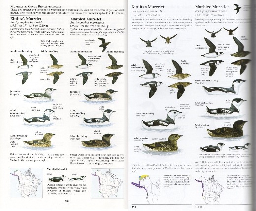
The Kittlitz's and Marbled Murrelet plate from the first (left) and second (right) editions. Notice the new and larger illustrations in the second edition (and that the juveniles are no longer included), as well as the additional text and changes to the range maps.
More text
It was widely commented upon how the first Sibley guide was textually sparse. But Rob Fergus points out that this is an illusion; it actually averages more words per species account than almost every other field guide. The second edition has even more. A block of text has been added next to each range map that gives information on population and habitats, as well as additional details on behavior, variation, and other things as appropriate. Essentially, this section is based on the text accounts from the Sibley regional guides. I always liked that part of the regional guides (as a new birder, I especially appreciated seeing whether the bird was common, uncommon, etc.), and am very happy it is now incorporated into the “big” Sibley. The identification-related text at the top of the account has also been expanded.
One feature I really like in the Sibley guide is the sidebars. This new edition includes some new ones, like Molt in Seabirds, Old World and New World Names, and Owling. A few of the older ones haven’t been carried over, such as Raptor Hunting Techniques. These sidebars continue to present a great amount of useful and relevant information.
Range maps
The range maps have, of course, been updated to reflect the latest knowledge of distribution. Also, instead of using dots to denote specific locations of rare occurrence, a more general region is shaded to denote where the bird rarely turns up. This change was actually introduced in the regional guides published after the first big one, but is done to an even greater extent here. Another welcome change is that instead of each map showing the entire continent, if a bird has a more limited range the map is “zoomed in” so that you can see that range more clearly.
Extinct species
The introduction of the first edition had a list of bird species and subspecies that have gone extinct and the date they were last recorded in the wild. Now an illustration has been added for each. This may seem like a small change, but a visual reminder of what we’ve lost is important.
Checklist
A checklist of all the species in the guide has been added to the back.
Size
Even with more illustrations and text, the trim size is no bigger than the first edition. There are 79 more pages this time around, but the increase in thickness and weight aren’t very appreciable.
Issues
Much has been made of how dark the artwork is in this new edition (see Brooke McDonald’s review). The difference from the first edition is truly striking. The good news is that in some cases this has greatly enhanced the artwork. But in others, like the Prothonotary Warbler, it detracts. It may just take some getting used to; already, the first edition is starting to look a little washed out to me. And it’s not as if every illustration across the board is a few shades darker. Some, like the nonbreeding Herring Gull, are actually lighter.
But, I’m sad to say, there are some true issues with the colors. Reds seem particularly affected. The Scarlet Tanager is way too dark; as are the bills of the adult breeding Laughing Gull and Royal Tern (it has a darker red bill than that of the Caspian Tern in the first edition!). But there’s also the opposite issue – the 2nd winter Heermann’s Gull is annotated with “red bill”, but its bill is unquestionably not red. Oddly, though, not all red looks off. The crown-patch of the Ruby-crowned Kinglet is fine, as is the Red-faced Warbler.
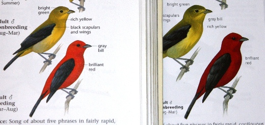
This isn't the best picture, but you can clearly see the difference in the Scarlet Tanagers. The first edition (left) was definitely brilliant red. The second edition (right), not so much.
I had a strong reaction to two other illustrations. The adult breeding Chipping Sparrow’s crown is too brown, and not that wonderful shade of rufous that I’ve loved since I was a little kid. And the Worm-eating Warbler’s head is too greenish, to the point that beginning birders could get confused. Both of these looked perfect to me in the previous edition.
The second issue is readability. The text is pretty small and relatively light on the page. The small font size is understandable given the increase in amount of text and both number and size of illustrations. But some sections of text are printed in not-quite-black, which has made it a little difficult for me to read in some lighting conditions. Those who have trouble reading small print should be aware.
As for other errors, I’ve only noticed one worth pointing out – the illustrations for Magnolia Warbler adult female breeding and adult male nonbreeding are swapped.
The Sibley Guide was already, in my opinion, the best field guide for North America. The second edition’s changes and additions have made it even better. I really want to give it a wholehearted recommendation, and would without the color reproduction issues. I started birding a few years after the first Sibley guide was published, but I understand its first printing also had some color issues that were corrected in subsequent printings. I hope that will be the case this time around as well. By all means, go ahead and get The Sibley Guide: Second Edition if you can’t wait. But otherwise, you may want to hold off for just a little bit in case it does get fixed.
Update: A second printing is now available that has fixed the color reproduction of the art and darkened the text to make it more readable. Here are more details.
Posted by Grant McCreary on March 8th, 2014.




Comment